
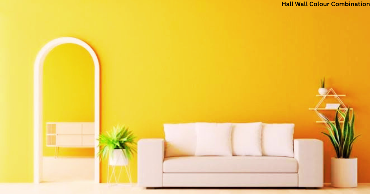
Picking the right hall colour combination feels confusing at first because the area has to feel welcoming, comfortable, and free from mismatched décor elements that leave a space looking cluttered.
A good hall wall colour combination does more than decorate a wall; it shapes the mood, the character, and the first impressions that families gather around and build memories in.
When I sat with Saumya Khanna, co-founder and principal architect at SSDA, she gave a deeper insight into how thoughtful colour choices create harmonious spaces, and that conversation changed how I think about wall painting for good.
Wall colours carry real influence over how large, bright, and calm a room feels, especially when the layout is compact or the hall deals with poor natural light.
A poorly chosen shade can make even a well-furnished room look dull and overwhelming, while the right wall shades, paired with the correct finishes, bring clarity, openness, and visual harmony.
This is why thoughtful combinations using marble-look, wood-look, glossy, or matte tiles turn ordinary Indian halls into spaces that stay functional and effortlessly stylish.
From timeless neutrals to bold wall colour ideas full of vibrancy, the secrets behind a best colour combination are simpler than most homeowners expect, and this article walks through every decision point, from picking the base shade to choosing living room tiles that make the hall walls shine.
White & Grey
The timeless pairing of white and grey never really leaves fashion, and that is exactly why it works so well as a hall wall colour combination.
Soft white on the walls gives an elegant design feel that suits both modern and traditional homes, and it adds a sense of calmness and serenity the moment you walk in.
Because both shades are versatile, homeowners need not think about an alternative every time they are changing furniture, and that understated style keeps working year after year.
For accents, dove grey and charcoal add just enough texture without disturbing the bland decor underneath, and grey-toned curtains complement the living area beautifully.
Interior designers often pick this combo as their go-to option because it complements almost any furniture or cushions placed nearby.
This design strategy stands as the main reason homeowners re-paint less often, since the classic, neutral shade simply provides long-term flexibility for living room wall painting, house owners, and accent walls alike.
Conclusion Final Takeaway
Getting the right hall interior colour combination is not just about looks; it transforms how the living room actually functions day to day.
When wall colours are picked with attention to light, space, and lifestyle, and matched with the correct tile finishes, the hall becomes balanced, welcoming, and timeless.
This kind of thoughtful planning rewards you with a comfortable, stylish, and adaptable room that holds up for years.
The choice of wall painting colours makes a huge difference, and it can either spoil or enhance the beauty of your décor in one stroke.
Because of this, it pays to be extra careful, since matching the theme and furnishings is a genuinely daunting task for most people.
My honest advice: don’t hesitate to take small risks with your colour scheme, because that is often how a room reaches its best possible extent.
Cream and Teal
Cream and teal make a lovely pair because cream builds a warm, neutral base while teal adds instant freshness and personality to the room.
This living room Indian hall colour combination particularly shines in homes with limited daylight, since the lighter base does the heavy lifting.
Cream marble-look tiles or beige matt finish flooring reflect light so well that the teal accents never feel heavy, which is exactly why this combination works exceptionally well.
White and Beige
White and beige remain one of the most versatile combinations for Indian homes, and there’s a reason designers keep returning to it.
White brightens the space instantly, while beige brings a gentle softness and warmth that keeps the room from feeling cold.
Glossy white tiles, beige stone-look tiles, or even light cream flooring can visually expand the hall, making it work equally well for modern and traditional interiors.
Grey and Mustard
Grey offers a calm, contemporary backdrop, and when you add mustard, it brings a controlled vibrancy without overpowering the room.
This pairing suits urban apartments just as well as modern villas, which is part of why it has become so popular lately.
Large-format grey tiles, cement-look flooring, or textured tiles in a matt finish support mustard cushions and artwork beautifully, keeping the space balanced instead of letting the mustard tone start dominating.
Olive Green and White
Olive green brings an earthy richness that feels grounded and natural, while white steps in and balances everything to keep the room fresh and open.
White glossy tiles or subtle stone-finish tiles pair beautifully here, particularly in homes that lean toward nature-inspired décor.
Peach and Brown
Peach introduces a gentle softness and warmth, while brown adds depth and stability, and together they create a combination that suits family-oriented Indian homes perfectly.
Brown wood-look tiles, neutral matte flooring, or a touch of light peach wall accents help connect the walls and floors seamlessly, so nothing feels disjointed.
Dark Green and Gold
Dark green paired with gold accents creates a refined, premium atmosphere that instantly upgrades a room, and this pairing works best in larger halls with controlled lighting.
Marble-look ivory tiles, glossy grey flooring, or white-vein tiles keep the brightness intact while complementing the rich wall colour rather than fighting it.
Sky Blue and White
Sky blue promotes a sense of calmness and openness, and white enhances light even further, which makes this combo ideal for small halls and medium-sized halls alike.
White high-gloss tiles, pastel ceramic flooring, or light blue accents help the room feel airy and relaxed from the moment you step inside.
Black and White
Black and white create a timeless contrast when balanced correctly, and the trick is letting white dominate the walls and floors while black gets used selectively.
Premium white marble-look tiles or textured black tiles add real sophistication without dragging the room into feeling dark.
Lavender and Grey
Lavender introduces a soft, calm quality, while grey keeps the whole palette feeling modern.
This combination suits homes looking for a relaxed, contemporary living room, and smooth grey polished floor tiles or stone-looks help maintain that visual balance throughout.
Terracotta and Cream
Terracotta adds warmth and cultural depth, while cream softens the overall look, and together they suit traditional interiors or any fusion-style Indian interiors you’re going for.
Terracotta-look tiles, rustic finishes, or cream textured flooring bring out that earthy appeal beautifully.
Choosing Tiles to Create a Spacious Indian Hall
Tiles play a bigger role than most people realize in how open or compact a living room feels, since the right pick improves brightness, cuts down on visual breaks, and builds real continuity between walls and floors.
Light-reflecting colours like white, soft grey, beige, and pastel tiles naturally reflect light, so compact halls appear larger and brighter almost instantly.
Large-format tiles cut down on grout lines, giving you a seamless surface that reduces visual clutter and boosts spaciousness overall.
Finish selection matters too: glossy tiles increase brightness, while matte tiles give a more understated look that suits relaxed interiors.
Balancing dark tones works well when dark wall tiles are paired with lighter wall colours, which stops the room from feeling closed in.
Consistency in layout, achieved by coordinating tile shades with wall tones, keeps the visual flow smooth and avoids abrupt transitions across surfaces.
At this planning stage, Simpolo Tiles & Bathware genuinely helps with layout decisions through wide size modularity, cutting down on joint lines for a more continuous visual flow across living room floors.
This is one detail I always point out to friends renovating their homes, because it helps Indian halls feel spacious, structured, and visually refined without extra ornamentation.
Styling Tips to Enhance Indian Hall Colour Combinations
Colour combinations work best when backed by smart styling decisions, and things like furniture placement, lighting, and décor choices decide whether a hall feels cohesive or visually scattered.
Sticking to one dominant wall colour and saving bold shades for accent areas keeps things from getting messy, while neutral furniture finishes let the wall colours do the talking.
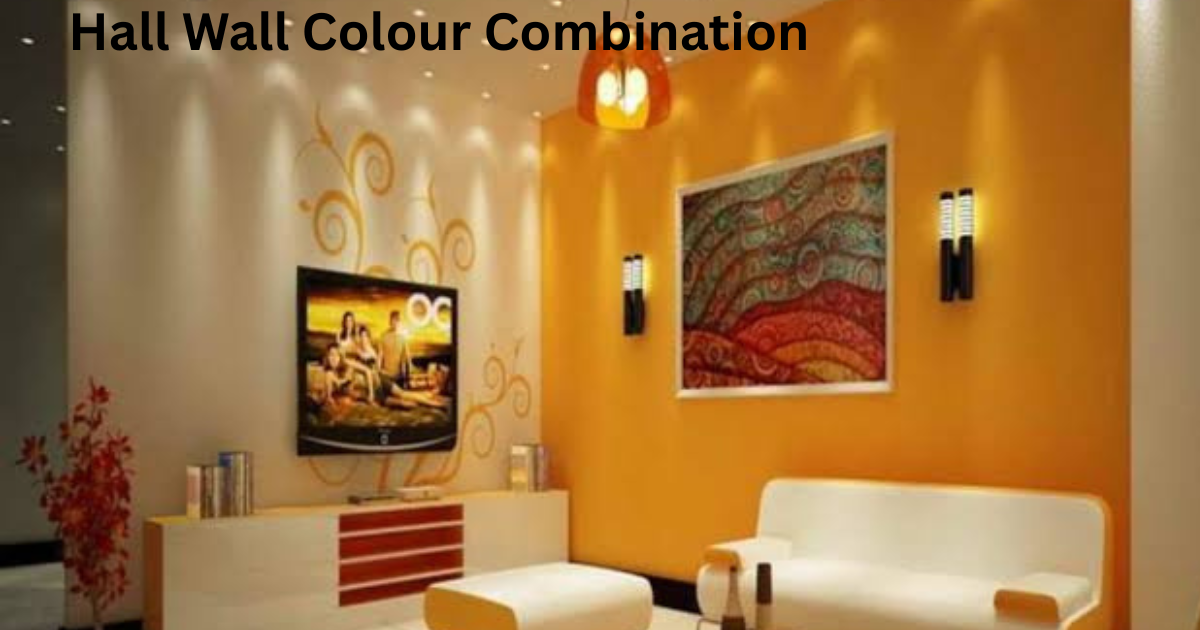 Matching soft furnishings like cushions and curtains to one of the wall shades ties the whole look together.
Good lighting should always complement the colour palette: warm lights suit earthy tones, while terrific lights work better with blues and greys.
Treating flooring as the grounding element that connects walls, furniture, and décor is a trick I’ve picked up from watching how professional designers approach a room.
For anyone wanting long-term consistency, Simpolo Tiles & Bathware supports this through surface technologies like Paper Matt Surface and Posh Surface, both built to hold their visual appeal in everyday living spaces.
Earthy Tones for a Natural Look
Earthy hues mixed with greens can turn a hall into something serene and revitalising, bringing a bit of nature indoors, which has become a genuinely trendy design trend.
This hall wall colour combination works best for a grounded space where you can relax after a demanding day, and a gentle, neutral backdrop in sandy beige or light brown sets the tone.
Adding emerald and sage through accent pieces like wall art, throw cushions, or drapes completes the natural look beautifully.
This combination creates a genuinely harmonious, organic appearance, and the earthy tones paired with greens seem to naturally stimulate thoughts of peace and rejuvenation, something I’ve noticed myself after repainting a hallway this way.
Warm Neutrals with a Pop of Colour
Warm neutrals bring a fusion of neutral hues into the design, making this hall wall colour combination a classic, adaptable style for almost any home.
They build a serene, comfortable ambiance that fits nearly every design approach, though a splash of colour adds real vitality to the mix. For the walls, shades like light taupe, off-white, or beige create a light, spacious impression without feeling too clinical.
Bringing in furniture, cushions, and drapes with brighter accents such as mustard yellow or terracotta adds the perfect balance to the overall design.
Pastels and Cream Tones
This soft hall wall colour combination built around pastel hues brings real authenticity to homes, and it pairs wonderfully with creamy tones whether you like light or robust tints.
Shades of pink, green, or cream tones add a dash of modernity to living areas, and letting pink act as the focal point keeps the whole look in harmony. Matching furniture, textiles, and décor in cream finishes off the style without ever overpowering the room.
Brass and Cherry Colour Combination for Walls
Brass and cherry make for an ideal home wall colour combination for anyone chasing a bit of luxury at home.
The cherry wall paint colour also adds coziness to the house, and because it aligns with so many interior décor styles and aesthetics, this wall painting combination opens up countless furniture and interior décor theme options.
Grape and Aqua Colour Combination for Walls
Interior designers and homeowners no longer shy away from experimenting with dark shades, which is why modern home designs increasingly feature grape and aqua wall paint colour combinations in the living room.
Counted among the trendiest wall painting colours today, darker accent walls bring a surprisingly warm feel to a space, and with a little creativity, you can even build a gorgeous wonderland look.
Mustard and Sapphire Colour Combination for Walls
The vibrant hues in this wall paint colour combo let you show off a bold, entertaining style while elevating the living room’s elegance. This hall colour combination also suits minimalists well, since it gives a sophisticated, spacious, clean look to interiors.
Sticking to best quality products, like the ones from Indigo Paints, helps you land that flawless finish every time.
Yellow and Peacock Blue Wall Paint Colour Combination
Don’t be afraid of experimenting with blush colours, because the electric mix of yellow and peacock blue genuinely uplifts the mood of a living area.
This pairing creates a perfect blend of warm tones and vivid tones, and the room ends up looking far more dynamic and exciting once this wall paint colour goes up in the hall.
Mahogany and Blush Pink Colour Combination for Walls
Mahogany and blush pink bring powerhouse hues into your décor, spreading a zesty, optimistic feel through the living room.
Both are true statement colours that blend beautifully with antique furniture and help build striking accent walls, making this hall colour combination a great pick for lifting the room’s mood.
Aqua Blue and Cream Colour Combination for Walls
Aqua blue and cream form a distinctive wall paint colour combination that gives the entire home a breezy, cool mood.
Here, aqua represents the sea while cream stands in for the sand, and this wall painting combination makes an ideal hall paint colour combination for a living room, especially in guesthouses and beach houses.
Crimson and Iris Colour Combination for Walls
The mix of crimson and iris helps create a genuinely comfortable space, adding a lively feel to the living room.
Choosing these hall colours brings a peaceful, relaxed ambience, giving your room the extra edge it needs in terms of look.
White and Tangerine Wall Paint Colour Combination
Tangerine is a dominating colour that also represents celebration, and it naturally unifies different areas of a home.
White stands for purity, making it perfect for spreading cheerfulness through the room, and both colours blend well with almost any interior décor themes, making this one of the most fascinating wall paint colours for the hall.
Brick and Teal Colour Combination for Walls
A flawless, eye-catching, spacious looking living room comes together beautifully with this smart mix of brick and teal colours.
These two shades enhance the space’s overall mood, and among the best colour combinations for walls, this one adds a genuinely calming feel to the room.
FAQ About Hall Wall Colour Combination
What are the most popular wall colour combinations for Indian living rooms?
The most popular wall colour combinations for Indian living rooms tend to lean toward warm, versatile pairings that suit everyday family life.
How can an accent wall be used effectively in a hall?
An accent wall works most effectively in a hall when it’s kept to a single feature wall, letting the rest of the room stay calm and balanced.
What tile colours suit neutral wall paints?
Tile colours in soft, muted shades generally pair best with neutral wall paints, keeping the whole look cohesive.
How can wood furniture be matched with wall colours?
Wood furniture can be matched with wall colours by picking wall tones that echo the warmth already present in the wood grain.
Can wall tiles replace wallpaper in living rooms?
Yes, wall tiles can genuinely replace wallpaper in living rooms, offering a similar decorative effect with far more durability.
Are earthy tones a good hall wall colour combination?
Earthy tones like sandy beige and light brown, paired with greens such as sage or emerald, create a genuinely calm, natural look and stand as one of the strongest picks for a hall wall colour combination.
Is white and grey a timeless hall wall colour combination?
Yes, white and grey bring lasting elegance and real versatility to a room, suiting both modern and traditional hall designs as a genuinely timeless hall wall colour combination.