
A tired wall colour can turn a bedroom into something boring, and that flat feeling often brings a quiet unease rather than rejuvenation.
Your bedroom is your personal sanctuary, so the paint you pick should never fight against rest or add visual clutter next to your furniture. Choosing a normal bedroom colour is really an act of personal expression, and it sits at the centre of effective bedroom design.
This guide brings together seven timeless shades, explains the hue that feels most psychologically soothing, and walks through core ideas from interior design that make a room versatile without looking normal in a dull way.
Think of this as a backdrop for your life, not a fleeting trend you will regret next year. We look at classic and contemporary colour choices, share design ideas and combinations, and help you make one of the more important decisions about your interior bedroom colour before you start sleeping in a freshly painted room.
The right shade relaxes the mind, recharges the body, and reflects your personality with a single colour choice. It shapes mood, brings comfort, and elevates the overall experience of coming home.
This complete guide blends trending ideas with the best choice for almost any home, from a medium tone to something bright, keeping every option broadly acceptable.
When choosing a medium tone or pastel shade, you can visualize how different combinations look using digital preview features on the Asian Paints Official Portal to avoid common painting mistakes
Why the Right Colour Matters
Colour is never just decorative it carries a real psychological weight the moment you close the bedroom door. Studies on shade and the mind show that certain tones can lower blood pressure, ease anxiety, and support deeper sleep, which is exactly what a bedroom should deliver.
A small room painted in a light hue feels airy and expansive, while the same paint in a large room can read as cold rather than intimate, so balance matters here too.
Choosing a warm, neutral backdrop lets your furniture, art, and textiles take centre stage, giving the space a sense of stability and coherence. The wall colour you settle on directly shapes the calming atmosphere, your sleep quality, and the overall room aesthetics, all while reflecting your personality.
A well-chosen shade can make a space feel bigger or cozier, and it brings harmony between lighting, décor, and mood. In simple terms, colour talks directly to emotion: soft tones soothe and invite relaxation, vibrant tones energize, and cool tones like blue and green suit bedrooms built for calm, while warm tones such as red and orange feel invigorating and are better saved for livelier areas of the home.
What Is a “Normal Bedroom Colour”?
A “normal” shade is usually a soft, neutral shade think white, beige, light grey, pastel blue, or soft green chosen to create a calm environment built for sleep.
It is normal because it fits almost every one of the popular interior styles, regardless of room size, lighting, or personal preference, and it stays soft and easy on the eyes night after night.
These shades are timeless rather than bold, which is exactly why they work so well for everyday living and remain versatile across changing styles.
A medium tone that is neither too bright nor too dark tends to be the most acceptable choice, and a simple white, a warm grey, an earthy tone, or gentle pastel shades all fall into this classic-looking, adaptable family. My own experience repainting client bedrooms confirms it: classic shades like warm grey feel warm and welcoming the moment you walk in, and pairing them with the right fabrics and accessories is often enough to refresh the room’s look without fully repainting a soft blue accent pillow can do more work than you’d expect.
Factors to Consider
Room size should guide your first decision: small rooms look better in light colours such as white, cream, or pastels, since these make a space feel bigger, while large rooms can carry darker tones for extra coziness.
Natural lighting changes everything too; bright rooms handle cooler tones like grey or blue well, but low-light rooms need warm tones such as beige or soft yellow to stay inviting.
Room direction matters as much as square footage: north-facing rooms benefit from warm shades for added brightness, while south-facing rooms already have plenty of light to work with.
Beyond the walls, think about how furniture, décor, bed design, wardrobes, curtains, and flooring interact with your chosen shade, since personal preference and the homeowner’s personality should always feel comfortable in the final result.
A shade also changes under different light sources; natural light versus artificial light reveals the true colour tone differently, since daylight brightens a hue, warm artificial light softens colours, and cool artificial light can push tones toward blue/grey tones.
Once the lighting conditions are settled, layer in textures and patterns through layering fabrics, prints, fuzzy rugs, patterned cushions, and layered bedsheets for visual interest, and let warm lighting further soothe the whole room.
White Off White
Soft whites and off-whites avoid the stark clinical white feeling by leaning into ivory, oyster white, or creamy vanilla undertones instead.
These shades feel pure, peaceful, and luminous, and because white reflects maximum light, it is a natural fit for small rooms or dim rooms that need to feel airy and spacious.
Used as a clean canvas, white lets rich dark wood furniture create real contrast and texture, especially when paired with chunky knit throws, jute rugs, and linen curtains.
An accent colour in pillows or artwork think deep blue or terracotta keeps the look from feeling flat.It remains a classic, clean choice for a genuinely airy environment, works beautifully in bigger rooms, and pairs with almost any décor, which is why designers keep returning to it for minimal interiors and other timeless choices in bright bedding and accessories.
Beige Warm Beige
Greige sits right between grey and beige, giving a cool contemporary edge alongside genuine warm comfort, and it quietly adapts to its surroundings.
Rooms with warmer undertones suit a cooler greige, while north-facing rooms or sun-drenched rooms can lean into either direction; it stays versatile, current, and timeless regardless.
Accent it with brass or copper metallic accents on the bedding, or go moodier with charcoal, dusty pink, or sage green, plus velvet cushions and silk lampshades for a layered look.
Warm beige, taupe, sand, and stone bring their own personality: layer in raw silk for texture, and the result feels soothing, grounding, and genuinely comforting.
In master bedrooms, these tones support relaxation and a sense of security, warmth, and cosy, lived-in charm, especially with contrasting textures like a chenille bedspread, linen curtains, and a wool rug. Add deep brown furniture, gold or bronze fixtures for a hint of luxury, or bring in navy blue and olive green accents for unexpected sophistication, a popular, cozy vibe that pairs naturally with wood furniture.
These are true earth tones: warm browns, beiges, and greens that feel natural and build a tranquil atmosphere through grounding tones, wooden furniture, and organic textiles.
Altogether, warm neutrals with metallic accents create a sophisticated, cozy look ideal for master suites, resting on a calm neutral base finished with glamorous metallics.
Light Grey
Light grey sits comfortably between beige, which can feel too warm, and white, which can feel too bright making it a sophisticated, serene, and flexible middle ground.
It supports relaxation and mental clarity without being stimulating or sombre, and it gives a modern bedroom a sleek backdrop to work with.
A monochromatic grey scheme across bedding, curtains, and rug feels intentional rather than boring, especially when balanced with natural materials like wood or wicker to cut any sense of coldness.
Add a vibrant accent such as mustard yellow or emerald green as a focal point, and the whole room turns stylish, a favourite in contemporary homes, minimal designs, neutral palettes, and urban interiors alike.
Powder Blue
Powder blue feels light, airy, and serene, almost like a clear morning sky painted straight onto the wall.
Research keeps pointing to blue as one of the few colours that can lower heart rate and steady metabolism, which explains why it supports better sleep.
It is often called the gentlest form of colour therapy, suiting children’s rooms and master suites equally well, especially against crisp white woodwork for a soft, cloud-like effect.
Pair it with coral or peach for warmth, or with slate grey accents for quiet dynamism; a nautical or eclectic vintage-wood styling both work here.
Pastel blue in particular reads as calming, a genuinely relaxing shade linked to better sleep, and it reduces stress while staying fresh, soothing, and welcoming to all age groups.
Sage Green
Sage green is a soft, muted green with gentle grey undertones, almost like dried herbs drying in afternoon light.
It is closely tied to peace, health, and renewal, and many designers call it the most restful colour for the eye.
It brings a spa-like feel that blurs the line between indoors and outdoors, especially alongside rattan headboards, bamboo blinds, and a few indoor plants. Pair sage with neutral linens, white, or beige, and add blush pink or terracotta accents to bring in extra warmth.
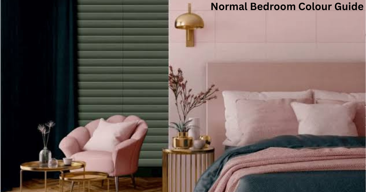
Soft Pink
Soft pink and other subtle pink tones create a gentle, welcoming environment that suits both modern bedrooms and cozy bedrooms.
It leans into romantic interiors with elegant styling, especially when mixed with other pastel shades. Soft pinks pair naturally with baby blues and mint greens for calming choices that never feel loud. Kept light, it gives an airy feel with just a subtle hint of colour.
Colour Combinations for the Bedroom
Pairing white and beige creates a look that is clean, warm, and quietly elegant, while grey and blue feel more modern and calm, and cream with green brings cozy, natural, fresh energy.
A balanced, stylish bedroom often relies on one of three approaches. The monochromatic route uses layering through varying shades of one colour several blues, for instance for a look that stays cohesive and gives a sophisticated look.
The complementary route pairs opposite colour-wheel pairs for dynamic contrast, such as soft lavender with muted yellow, or navy blue with soft peach.
The analogous route leans on neighbouring colour-wheel tones for a naturally harmonious look, think blues fading into greens for a tranquil seaside feel.
Whichever path you choose, keep a neutral base, add one confident accent, a grey base with a bold accent pop in teal or mustard works well and repeat that accent through accessories for a modern focal point.
A tone-on-tone approach using the same colour at different strengths builds real depth and a layered sophisticated feel, seen well in soft pastels against dark wood furniture, or blush pink with lavender for something quietly striking.
For a soft balanced contrast, try a bold feature wall against otherwise neutral furnishings bright blue or a green accent wall with cream furniture both work while a minimalist black and white scheme (white walls, light bedding, black furniture or accent pieces) gives a clean high-contrast look; keep the split closer to 80/20 than 50/50, since an even split can feel harsh.
An all-white room brought to life with colourful throw pillows and rugs in turquoise or coral lets personality shine without repainting proof that even a plain white room stays easy to change.
Testing Colours Before Finalizing
Never trust a paint catalogue alone, always buy test samples and brush them onto the actual walls you plan to paint.
Check the patch at different times of day under both natural light and artificial light, since the way a colour reads can shift dramatically between morning and night.
Larger paint swatches or sample boards held against the wall under real lighting conditions give a far more honest preview than a tiny chip.
I always tell clients to live with a swatch for at least two full days throughout the day before committing, since most paint brands now offer online colour-visualization tools to preview a shade digitally before physically painting the whole room.
Common Mistakes to Avoid
Painting a small room in overly dark colours without checking lighting conditions first is one of the most common regrets homeowners share with me.
Chasing short-lived trends while skipping proper sample testing often leads to disappointment once the paint dries and looks nothing like the swatch.
 Choosing bold colours without matching them to the existing colour, furniture, and décor can throw off the whole room. Finally, using too many colours in one space confuses the room’s mood and works against its intended purpose: a bedroom needs restraint more than variety.
A Lavender Grey
If you want something slightly different from the usual list, consider lavender grey a soft blend of lavender and grey that carries a subtle spiritual quality and real sophistication.
It stays soft and romantic, a gently uplifting hue that works as a unique alternative to standard neutrals.
The calm, faint purple undertone can spark creativity while still supporting relaxation, which makes it lovely in reading nooks.
Pair it with espresso wood, crisp white linens, and silver or nickel metallics for accessories, or push it moodier with dusky purple against white for a genuinely beautiful bedroom.
None of this requires a radical, expensive overhaul; a normal bedroom colour should be one that resonates personally, supports rest, and gives a harmonious backdrop to your life, which is the same advice design experts give again and again (not just brand messaging from any one paint company, including HomeLane).
An 8-Step Process for Picking Your Shade
Start by naming the mood you want calm, cheerful, cozy since that single word can point you toward blues, neutrals, or gentle warmth.
Next, shortlist a few families like beige, cream, quiet elegance, grey, or soft pink, and always test before finalizing on the real wall.
Decide whether you want accent walls for depth in the overall design, and check the balance across the whole room, not just one wall.
Match with furniture, including bed frames, wardrobes, and side tables, so the palette works as a system rather than in isolation.
Think long-term instead of chasing trendy colours; a neutral, timeless shade stays elegant and rarely needs repainting for a quick Normal Bedroom Colour Guide.
Let room size guide the tone: light colours and space suit small rooms, while dark tones suit larger rooms for openness or coziness.
Check lighting conditions, since natural light pairs well with cooler tones, while low light calls for warmer shades.
Finally, settle a colour scheme using something like the 60-30-10 rule for balanced, visual harmony, keep the room clutter-free with matching curtains and cushions, layer in soft lighting through lamps or LED strips, add minimal décor.
And finish with texture through rugs, throws, and indoor plants for freshness whether you lean toward neutral minimalism in soft whites, greys, and beiges, or nature-inspired themes in greens and earthy tones, or even playful two-tone walls for extra character and personality.
A calm personality suits blue, a creative mind enjoys pastel tones or bold, modern, darker shades, and a nature lover naturally gravitates to green find the right combination and the room turns genuinely stylish, or bring in a professional interior designer for a tailored bedroom makeover near you.
Style-Based Ideas Worth Trying
For a traditional feel, lean into dark, warm colours like red or brown alongside antique-look furniture and intricate décor; for something more contemporary, keep clean lines with pastel colours and one vibrant accent colour.
A Scandinavian bedroom stays simple and functional through a washed-out palette of whites, greys, and pastels, often in a minimalist, monochrome scheme of light single-colour schemes across the whole space.
A more rustic approach leans on light, plain colours and natural materials for a warm, country feel. Across all these styles, the 60-30-10 rule still applies: pick a primary colour, a secondary colour, and an accent colour to stay visually balanced.
Finish choice matters too; matte hides imperfections and suits ceilings or low-traffic areas, satin or eggshell gives subtle sheen and stays washable, and semi-gloss stays durable and reflective on woodwork, skirting, and doors.
Swap out pillows, curtains, rugs, or art for a quick refresh of the room’s personality without a full repaint, or add one brightly coloured headboard as an instant focal point.
A splash of light lavender or muted teal alongside a dependable traditional beige rounds out the frequently searched options, each one a harmonising background that stays easy on the eye.
FAQs About Normal Bedroom Colour
What are the best normal bedroom colours for 2026?
Heading into 2026, the strongest picks stay warm and earthy, think soothing neutrals, warm beige, greige, sage green, lavender grey, and cool greys all comforting and part of the wider move toward nature-inspired palettes.
How do I choose the right normal bedroom paint colour?
Check your natural light first: warm colours suit north-facing rooms, while cool tones suit sun-drenched ones, and room size should guide whether you reach for light colours in small rooms. Beyond that, follow the mood you want: calm points to blue or green, cosy points to beige or warm white, and sophisticated points to grey or greige.
What are the trending modern normal bedroom colours?
Greige and sage green continue to lead, alongside warm creamy whites paired with natural materials like wood, rattan, brass, and copper metallics.
What are the latest modern normal bedroom colour ideas?
Sage green still delivers a spa-like feel, dark wood with navy accents brings cosy elegance, and a monochromatic grey scheme with varied texture feels current. Lavender grey stays soft and offers a romantic alternative to standard neutrals.
Which normal bedroom colour is best for small rooms?
Light colours such as white, beige, or pastels work best in small rooms, since they make the space feel bigger and brighter.
What is the most relaxing bedroom colour?
Soft blue and green, alongside gentle neutral tones, are widely considered the most relaxing choices.
Can I use dark colours in a bedroom?
Yes dark colours work well as an accent wall, especially in larger rooms, but they can make a smaller space feel tighter if overused.
How do I choose a bedroom colour for better sleep?
Lean on calming shades like blue, beige, or soft grey to build a genuinely peaceful environment.
What is the best colour for a relaxing bedroom?
Pale blue, green, or grey all carry a proven calming effect.
Can I use bright colours in a bedroom?
Use bright colours sparingly as a secondary colour or accent colour rather than the dominant wall colour since too much can feel overly energizing before bed.
How can I test a paint colour before painting the room?
Watch it under different lighting conditions across the day, using paint swatches or sample boards on the wall before fully committing.