
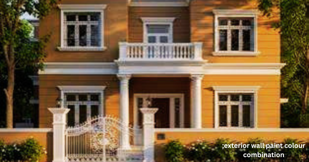
Picking the right exterior wall paint colour combination sits among the most important decisions you’ll make for your home.
The paint you select says more about your house than most people realize it’s often the first thing a guest notices walking up the street, long before they reach the doorbell, and that first impression sticks.
In India, this choice carries even more weight because the country deals with varying climate zones, from intense summers up north to heavy monsoons rolling in along the coast.
That kind of range means your colour choices can’t just chase passing trends they need staying power.
A well-planned colour combination does far more than decorate; it protects your walls, pushes back against heat, resists dust and grime, and gives genuine personality to your home’s exterior.
Whether you’re finishing a brand-new bungalow, fixing up an old independent house, or simply repainting a duplex, knowing which shades belong together saves real money down the line and spares you the regret of a choice that ages badly.
Why Exterior Colour Combinations Matter
Your home’s exterior colour isn’t just cosmetic it quietly shapes resale value, curb appeal, and how gracefully the structure ages through the years.
India’s harsh sun, seasonal rain, and constant pollution wear down ordinary exterior paint faster than most homeowners expect, which is why lighter shades that reflect heat keep interiors cooler while textured finishes do a better job hiding dust marks and stains between repaint cycles.
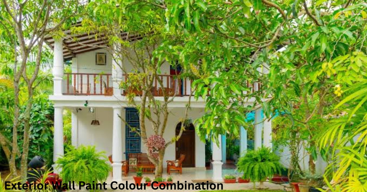 There’s also a cultural layer to this decision that I’ve seen play out in real projectsmany families weigh Vastu principles and regional cultural preferences before locking in a final colour scheme.
Beyond tradition, that combination needs to sit comfortably alongside architectural elements like balconies, pillars, grilles, and roof tiles, because a clashing colour fights the eye instead of working with it.
Popular Exterior Wall Paint Colour Combinations
White and Grey remains a dependable favourite for modern homes, thanks to its clean lines and neutral tones that suit everything from minimalist boxes to traditional villas.
Beige and Brown brings a warm, earthy feel that pairs naturally with stone cladding and wood-look finishes, making it a regular choice for independent houses and farmhouses built for comfort over flash.
Terracotta and Cream pulls straight from traditional Indian architecture, working beautifully alongside rustic tile finishes rooted in regional styles.
Charcoal and Light Grey creates a bold monochrome statement that highlights geometry and sharp facade lines, a strong fit for contemporary builds.
Olive Green and Cream offers a nature-inspired, calming, grounded feel that suits homes wrapped in greenery.
Sky Blue and White works particularly well in coastal and hot-climate regions, reflecting heat while keeping things fresh and breezy.
Mustard Yellow and White adds vibrancy without tipping into excess, usually deployed as an accent rather than a full-coverage shade. Sandstone and Deep Brown suit luxury elevations, pairing premium texture with a rustic, grounded tone that feels deliberate rather than loud.
Choosing Colours Based on Climate
In hot regions, light-coloured exteriors cut down on heat absorption, keeping indoor temperatures more manageable and easing the load on cooling appliances.
Dark exterior colours, though undeniably visually striking, soak up more solar energy and can speed up paint degradation which is why I generally recommend treating them as accent features rather than going for full coverage, especially across warm climates.
In coastal areas, picking moisture-resistant and weather-resistant paints matters more than the actual colour, since humidity and salt air break down ordinary finishes fast.
Regions hit hardest by monsoons benefit from textured finishes and water-repellent coatings that shield walls from dampness and ugly staining over time.
Tips for Picking the Right Combination
Keep your palette to two or three shades at most go beyond that, and the exterior starts looking busy rather than intentional, a mistake I’ve watched plenty of homeowners make.
Always test colour samples straight on the wall under natural daylight, since a shade that looks perfect at noon can shift dramatically by dusk.
Bring the roof, gates, railings, and window frames into the same unified decision, since these elements visually talk to one another whether you plan for it or not.
Lean on heat-reflective paints in warmer regions to trim down energy costs, and reach for moisture-resistant finishes if you’re near the coast or living through high-rainfall zones.
Think long-term with every combination you choose something that looks fresh today should still hold up five to ten years from now, well after the scaffolding comes down for good.
Conclusion
A strong exterior wall paint colour combination blends climate sense, architectural harmony, and personal style into one cohesive look that genuinely reflects you.
Whether you lean toward a classic grey and white, a warm terracotta and cream, or a bold charcoal monochrome, the goal never really changes a home that feels intentional, ages well, and welcomes you in every time you pull into the driveway.
FAQS About Exterior wall paint colour combination
Which colour combination is best for small exterior walls?
Light shades such as white, pale grey, or cream work best on smaller exteriors because they make the structure appear larger and more open, while darker accents on doors or trims add just enough contrast without crowding the space.
Are dark exterior colours suitable for Indian weather?
Dark exterior colours trap more heat and tend to fade faster under harsh Indian summers, which is why I usually suggest keeping them as accent shades rather than choosing full-coverage colours in genuinely hot climate zones.
How many colours should I use on my house exterior?
Most designers stick to two to three colours at most typically a base shade, a secondary tone, and an accent colour reserved for trims, doors, or other architectural highlights.
Does the exterior colour affect resale value?
Yes a thoughtful exterior colour combination genuinely boosts curb appeal and can lift resale value, since buyers form their first impression of a house before they ever step through the door.
What is the most trending exterior colour combination right now?
Grey and white keeps its strong trend across Indian cities for its modern, minimalist appeal, though earthy combinations like beige and brown still hold steady ground in traditional and semi-modern homes.